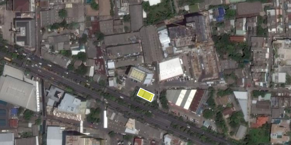
Location: Bangkok, Thailand
Type: Architecture and Interior Design
Program: Showroom
Client: Krungthai Land Development
Site Area: 1,200 sqm.
Built Area: 500 sqm.
Design: 2012-2013
Completion: 2014
Construction Cost: 10M baht
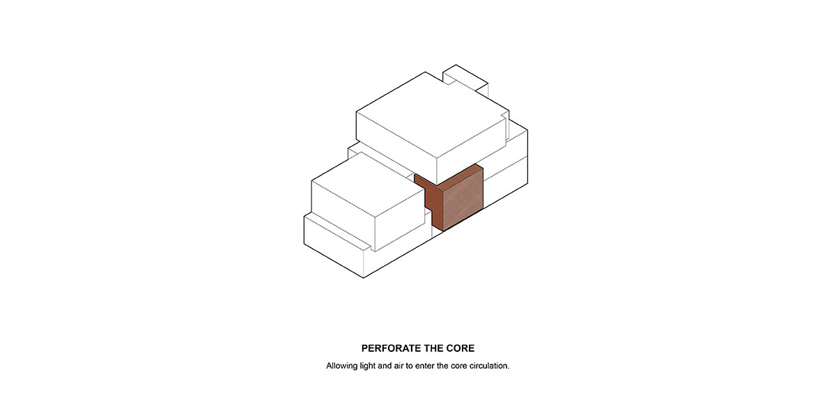
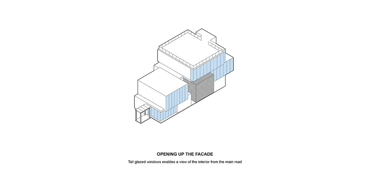
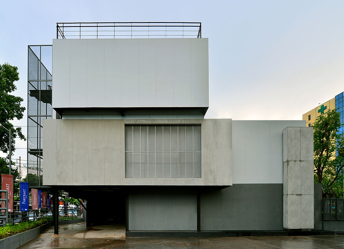
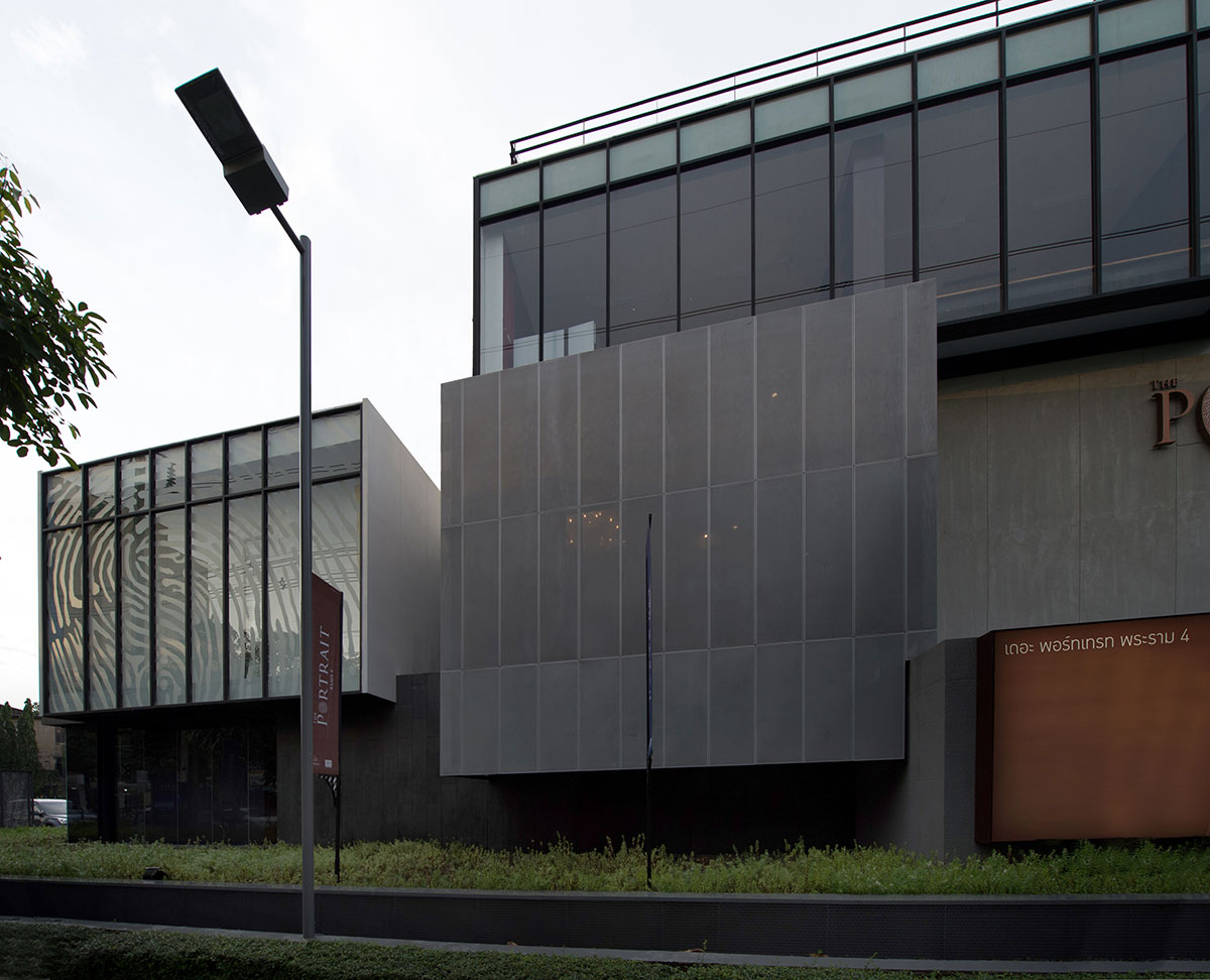
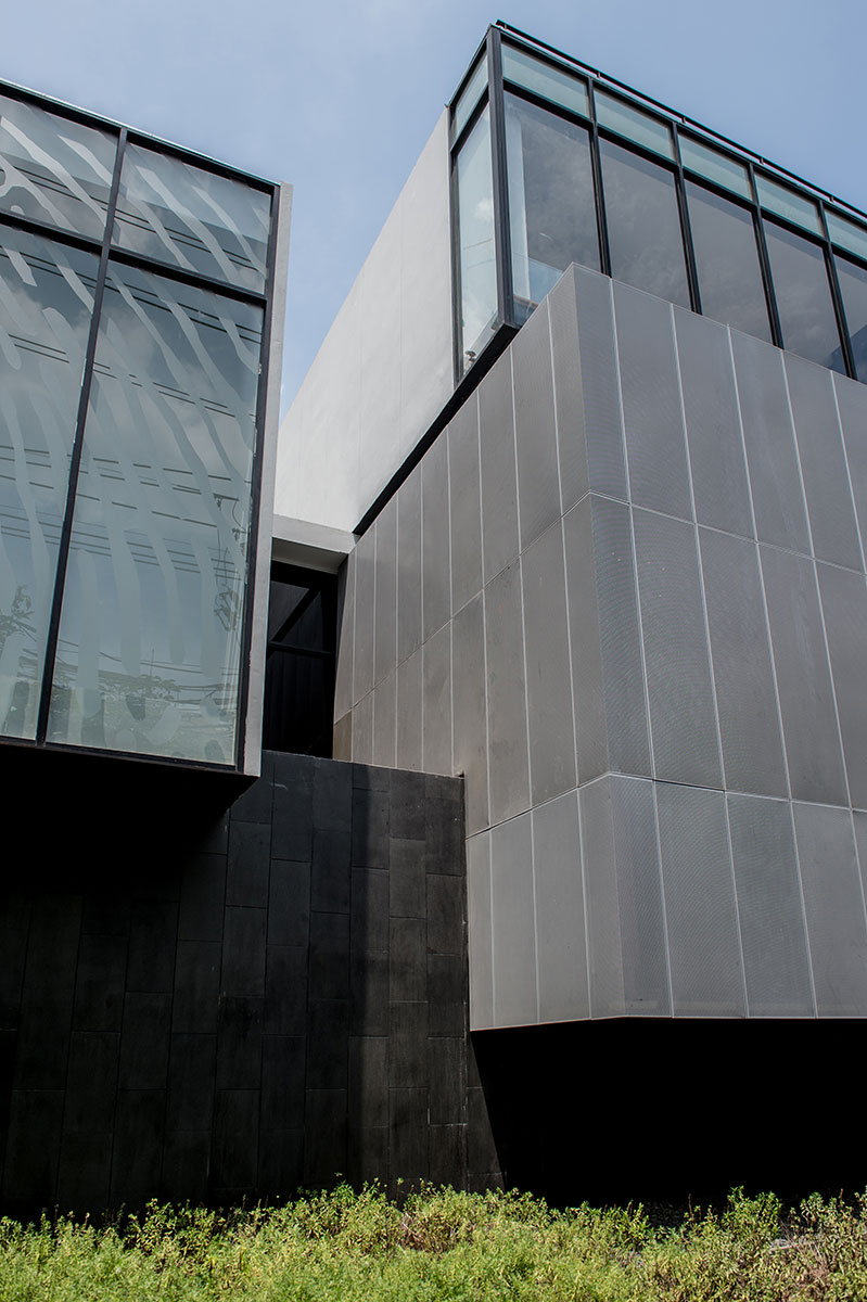
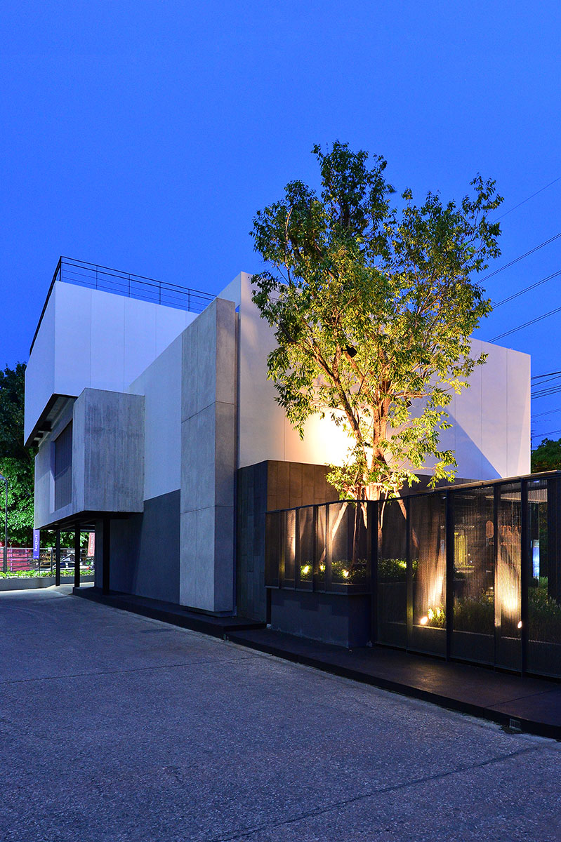
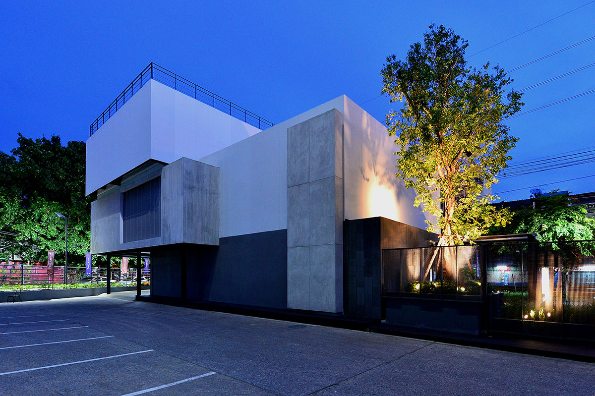
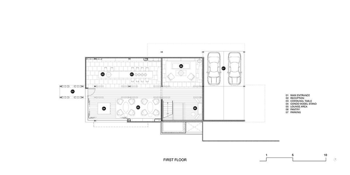
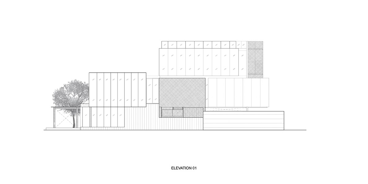
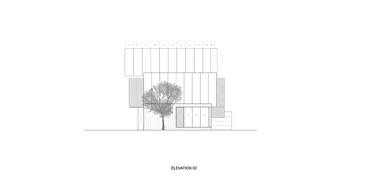
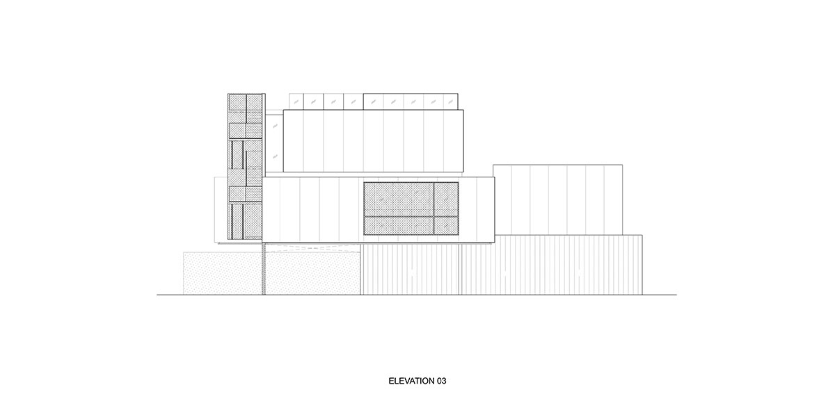
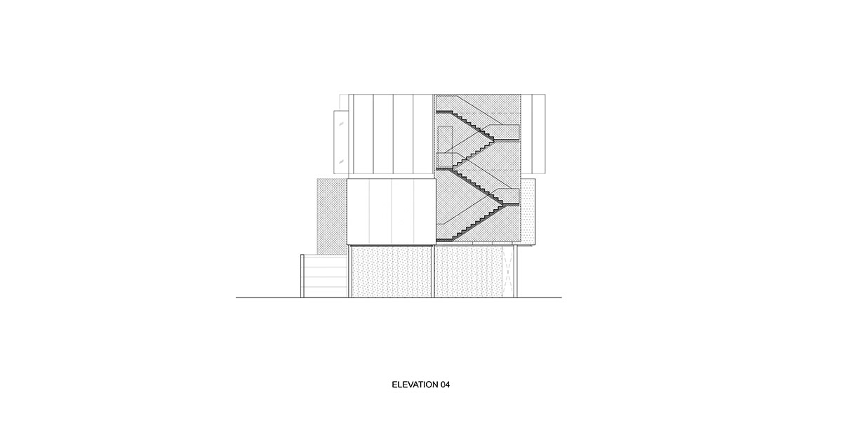
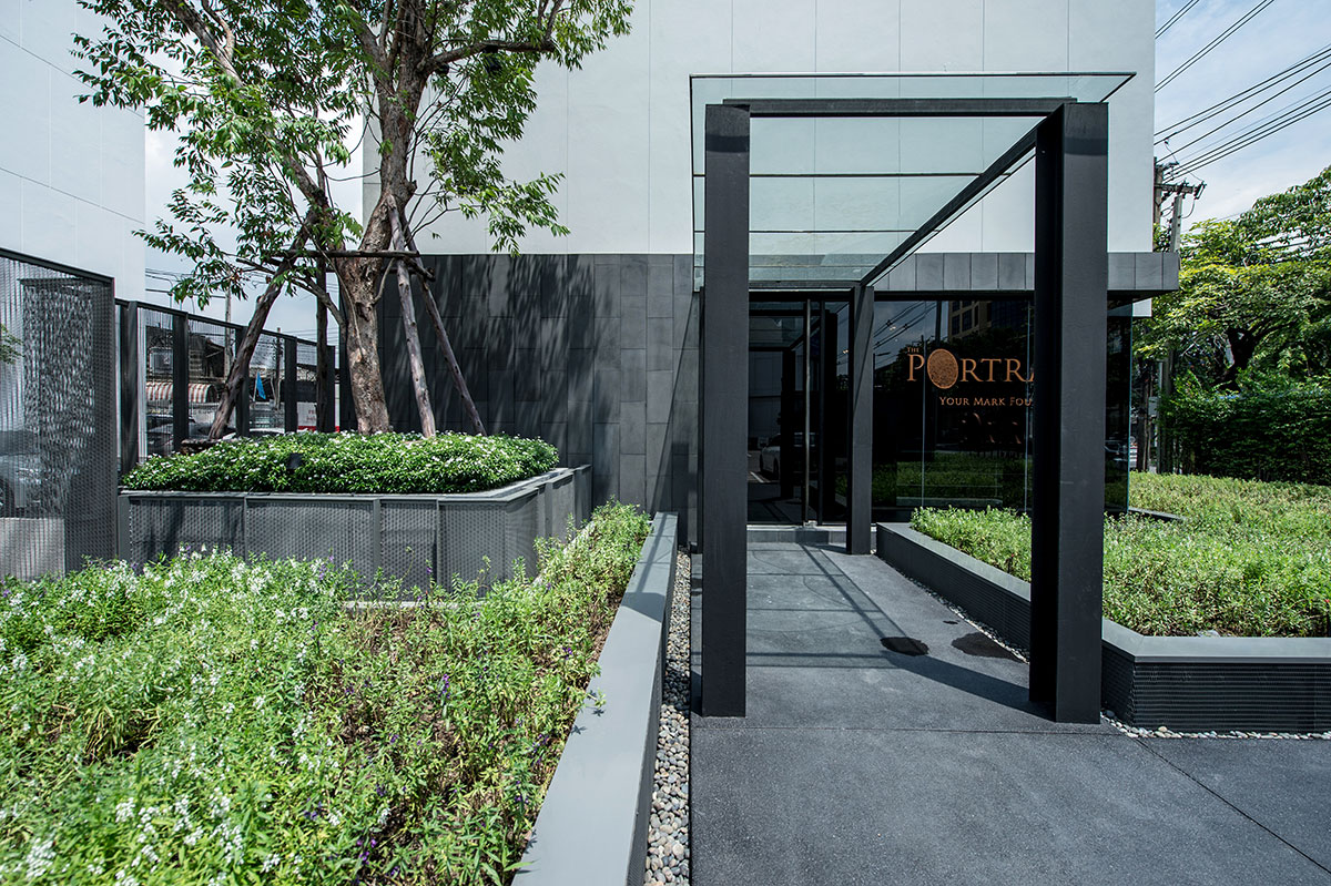
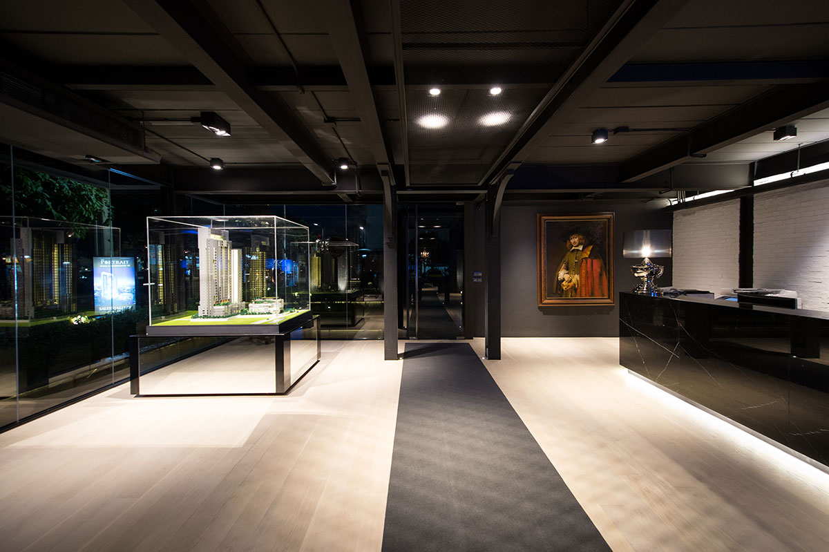
By virtue of building architecture with steel, it needs to expose its significant intrinsic values of being able to produce with high speed and being the easiest way to institute. The Portrait was firstly aimed to be a displayed showroom for lighting appliances. Responsible as the project designers, Stu/D/O Architects added the magic trick to it. Likewise displaying the sculptures in art museum, the light had to show its well-rounded qualities to the lenses of the beholders. Thus, this was the time when the architectural elements intervened. The solid walls, perforated panels, and stripe glazing were chosen to high lighten the products. Different materials performed themselves as the background panels for lighting reflection; to demonstrate the products’ specialized function and to show the distinct characteristics of each light displayed.
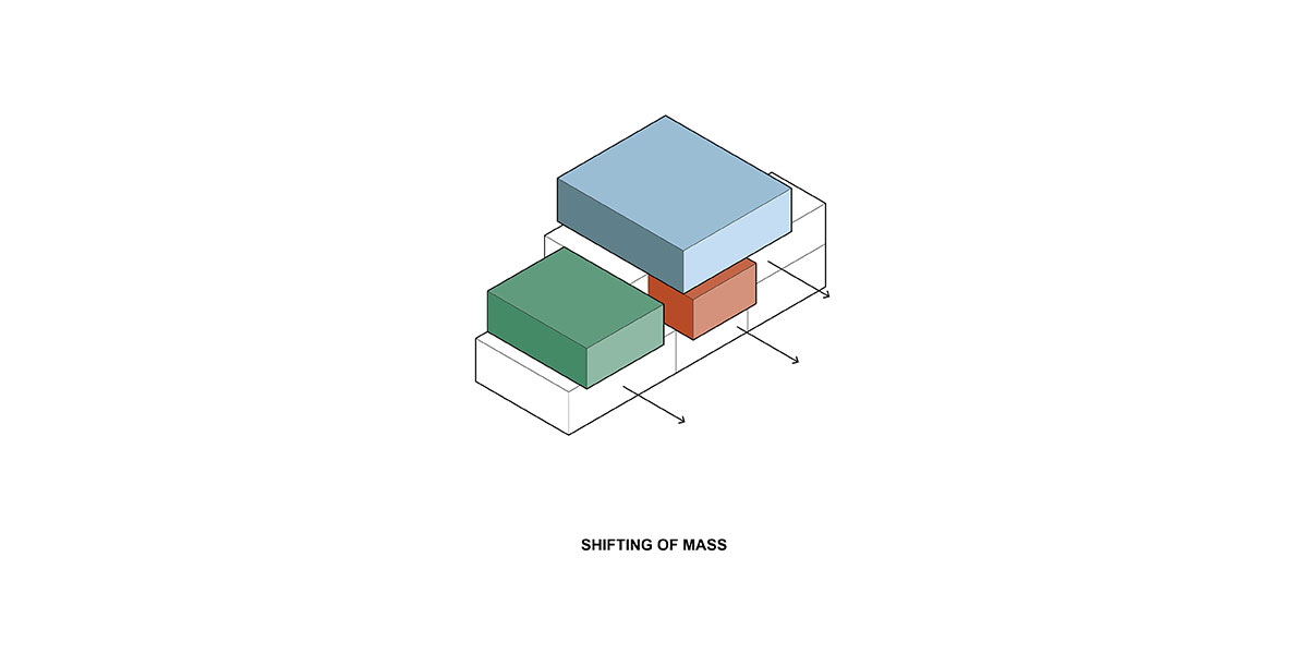
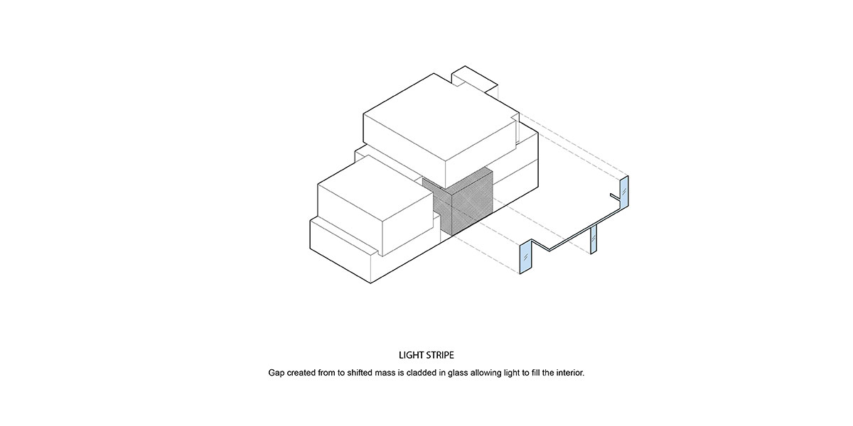
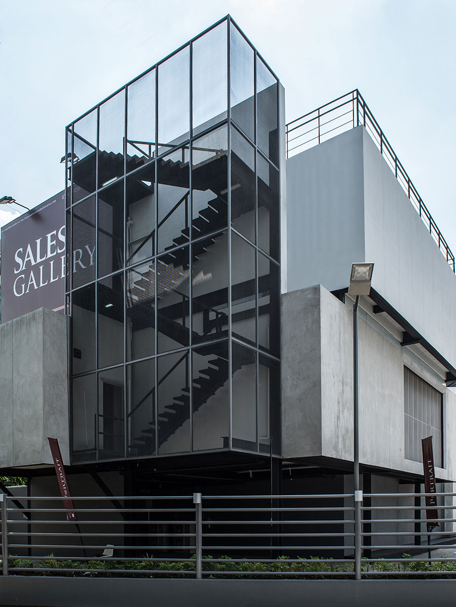
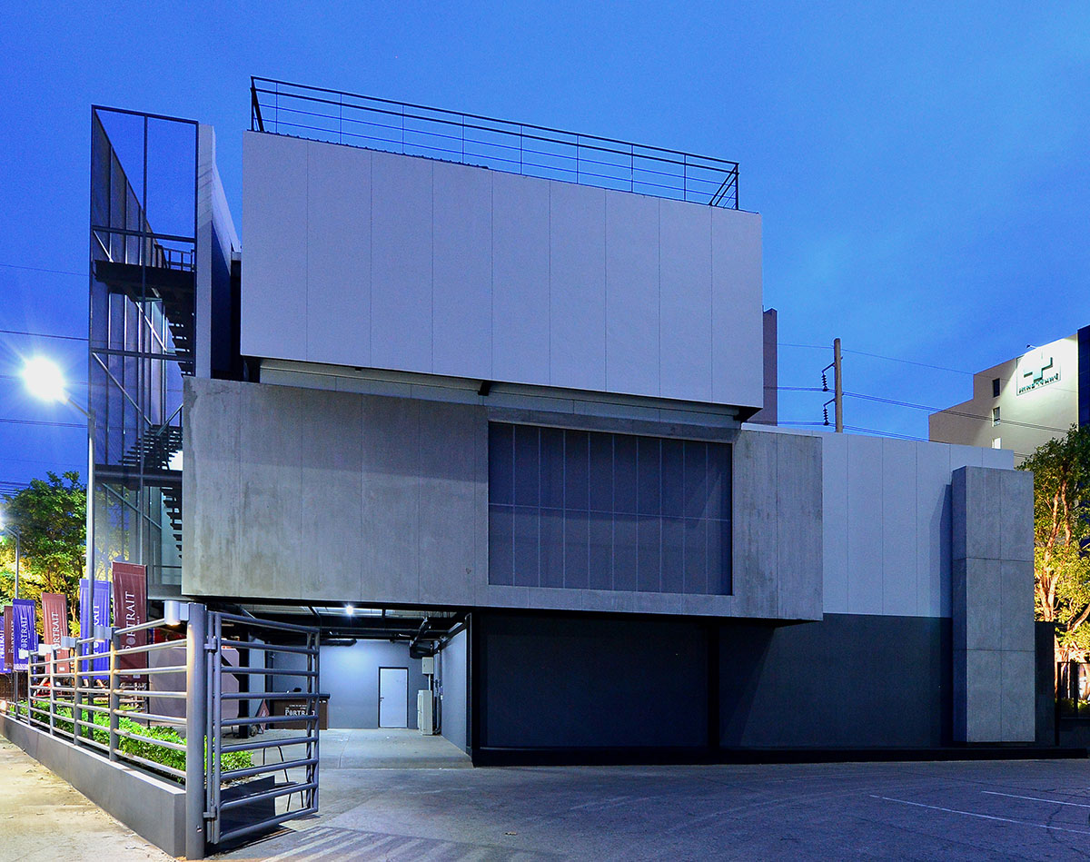
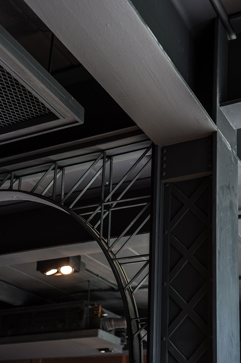
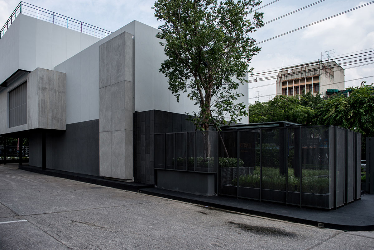
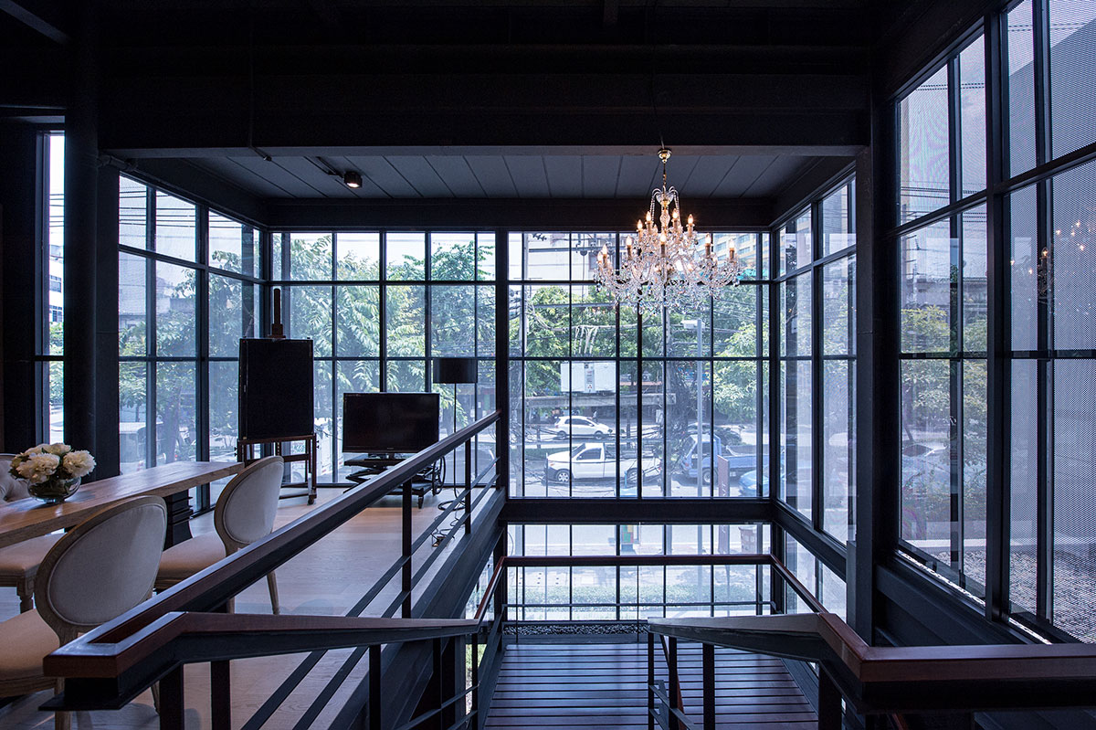
By smearing along the walls, rebounding the light back, or shining sparsely through various materials; all of these qualities needed to be seen in the showroom. Despite the first intention of the owner who would like to see the entire completion within three months, steel was brought to use as the mean. To solve the former thick and heavy-looked structure, steel has created the sharp cutting edges between each mass. The architects decided to construct the brick walls over of the L-shaped beams and used the beams to clearly detach the masses according to its specific duty. Then, put the transparent glazing stripes in between. In which they run along the boundary lines, the steel stripes explicitly emphasized each mass to be more noticeable.
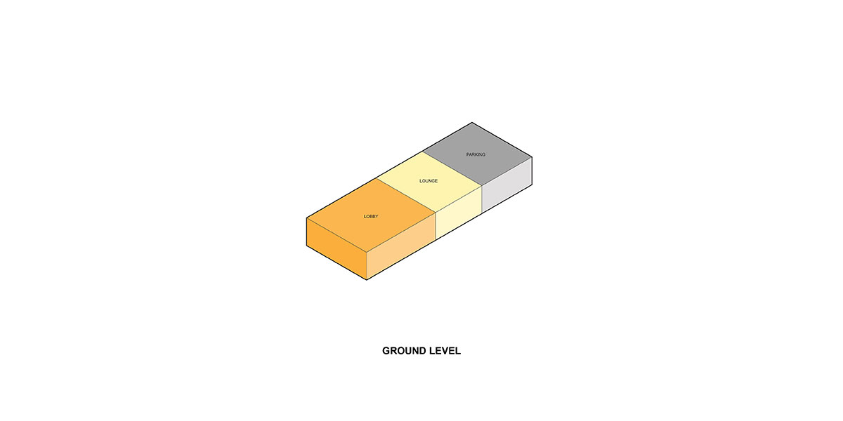
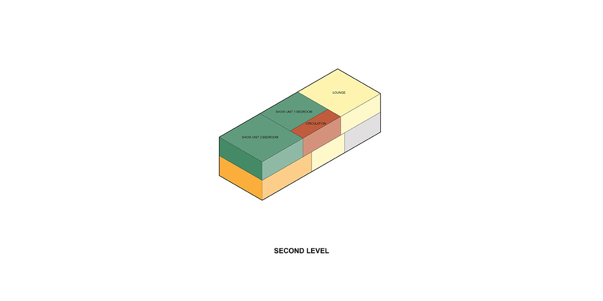
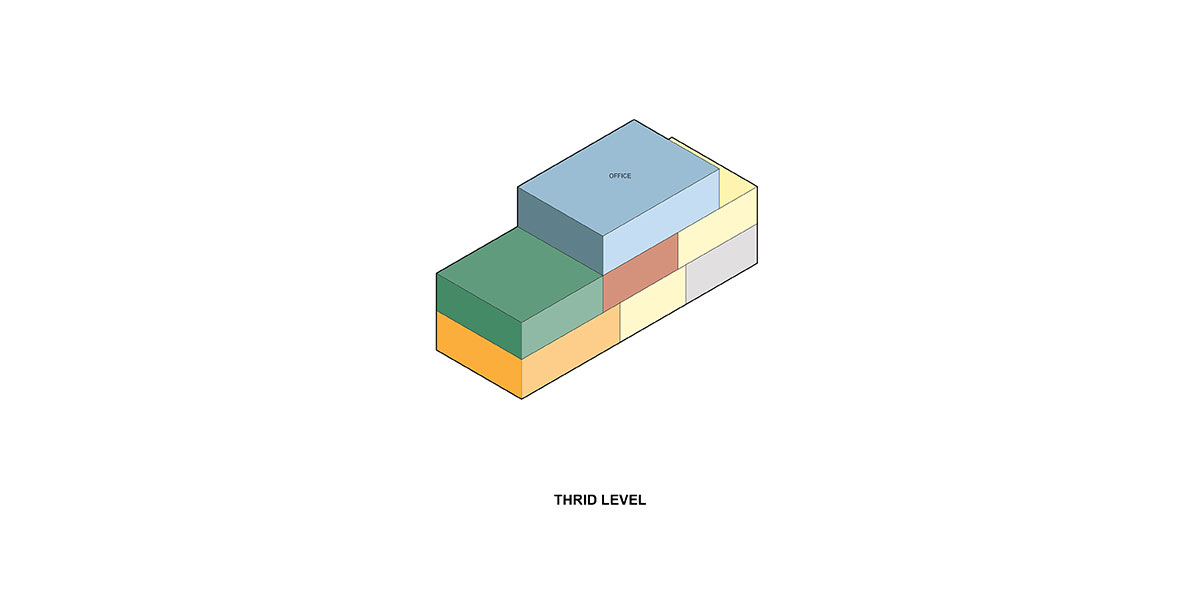
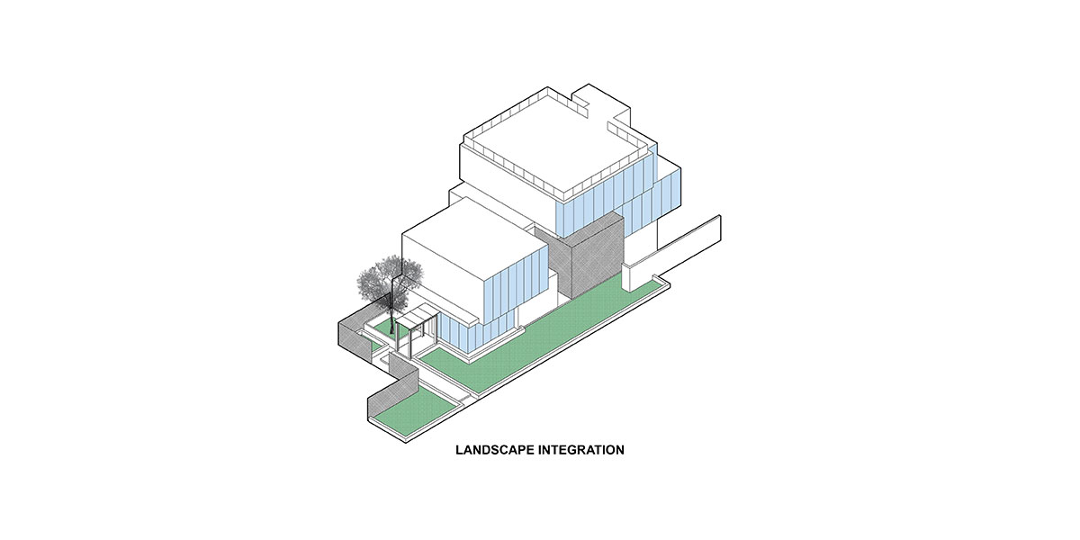
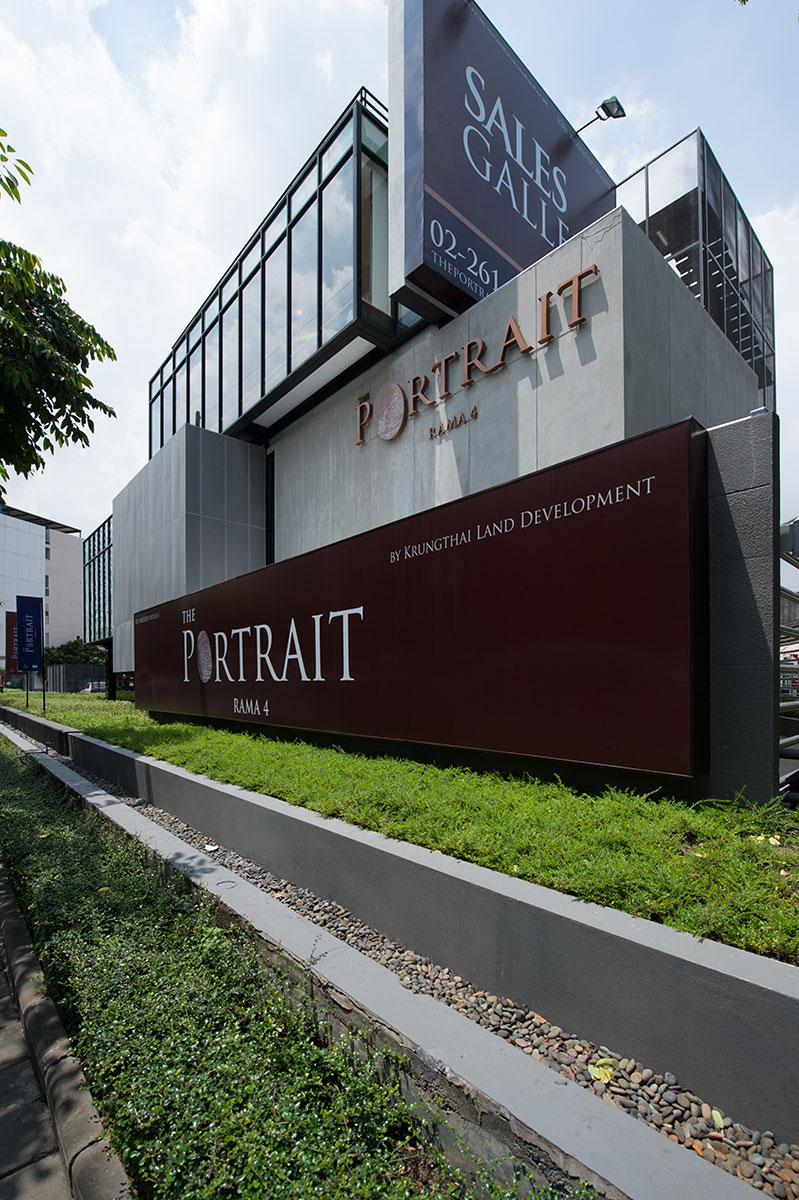
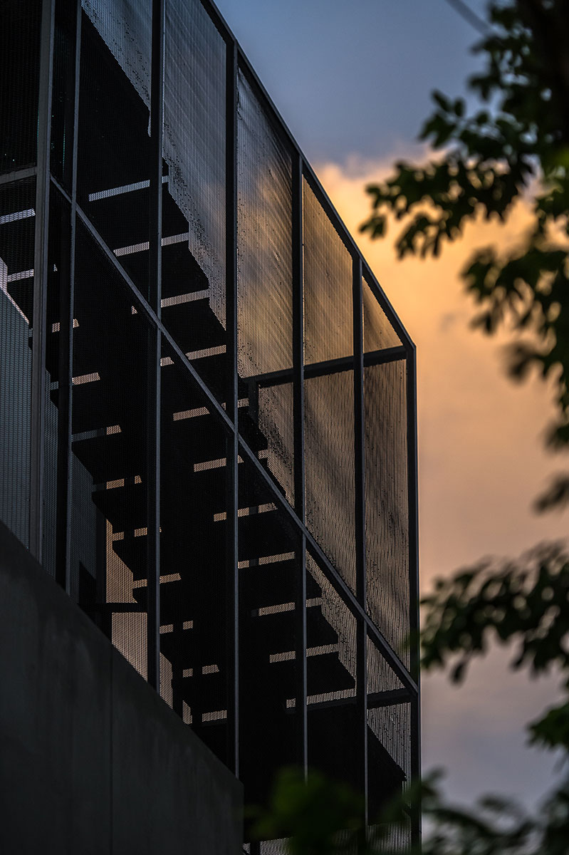
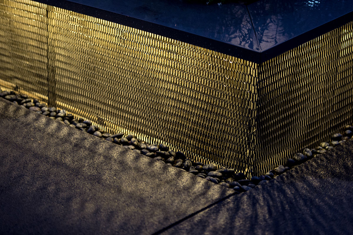
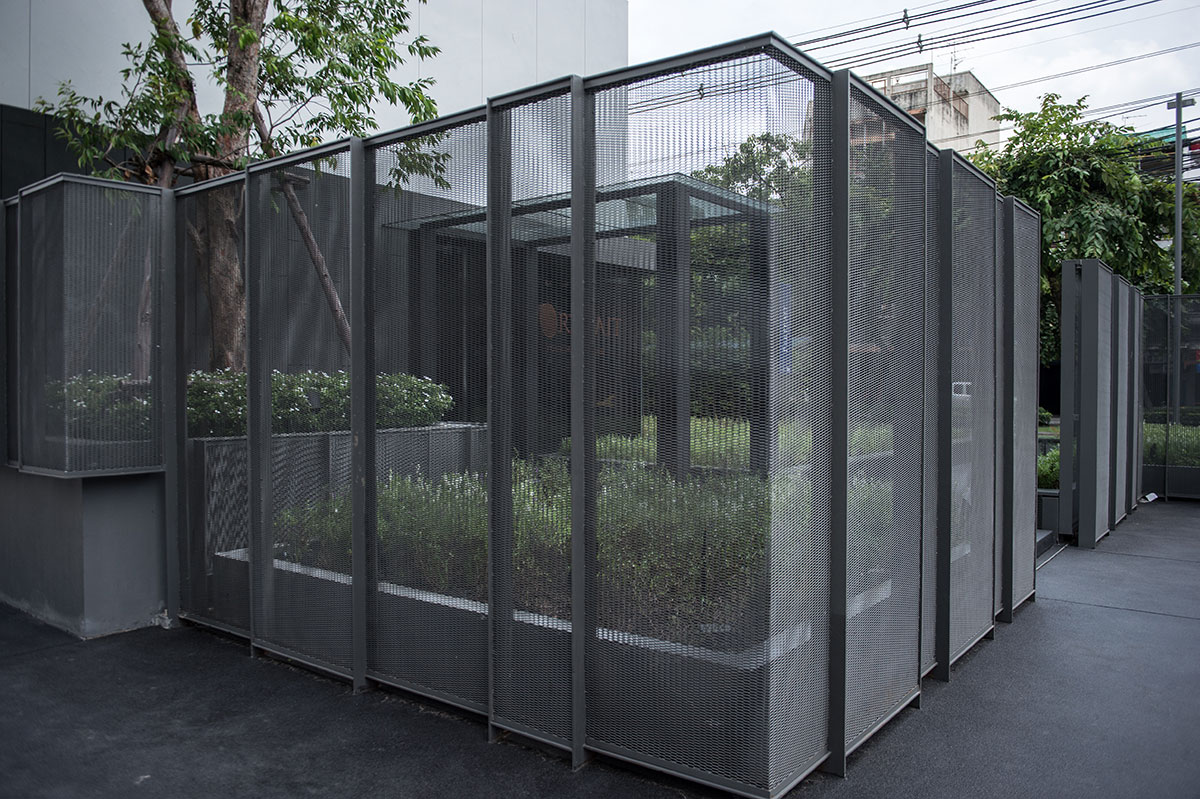
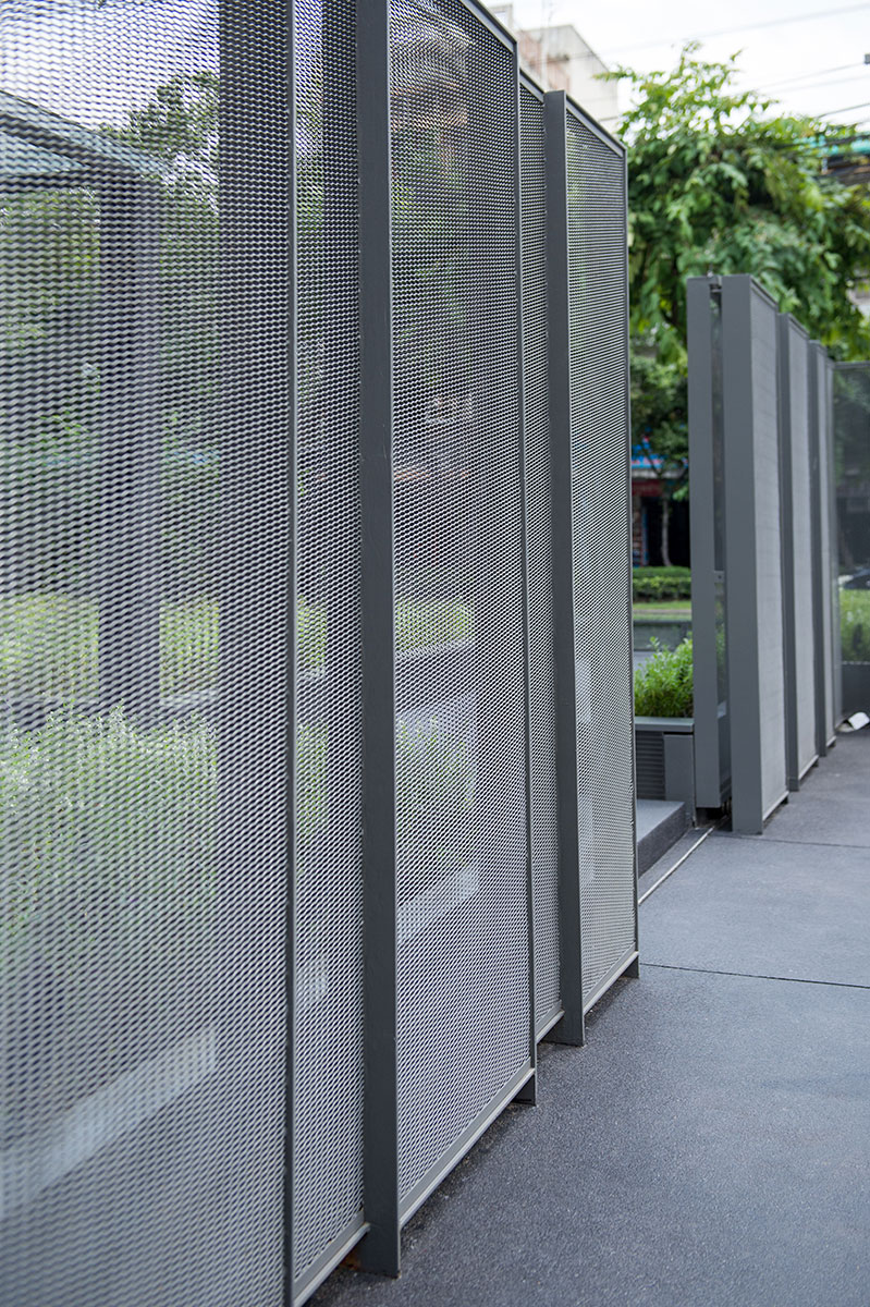
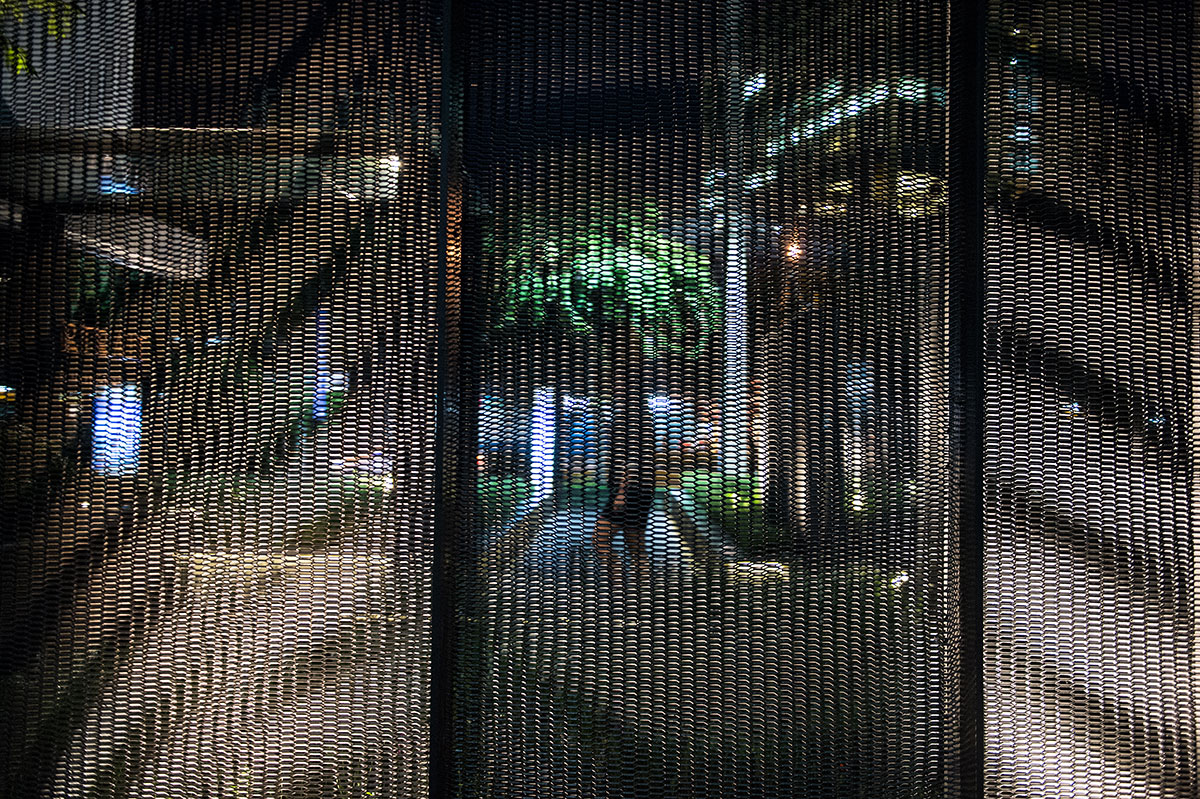
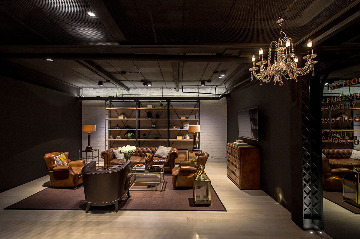
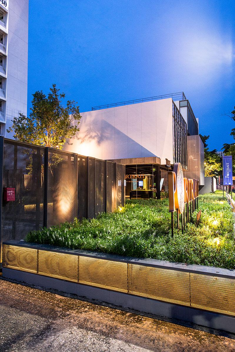
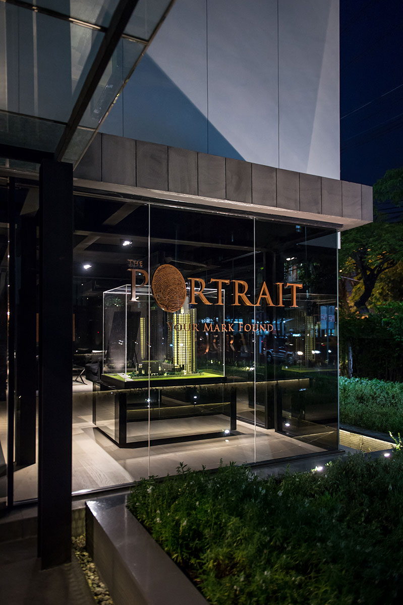
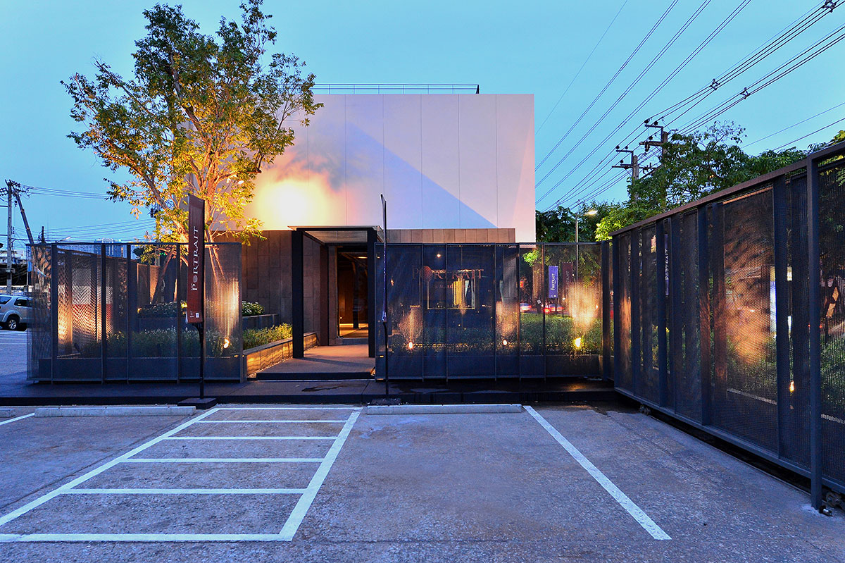
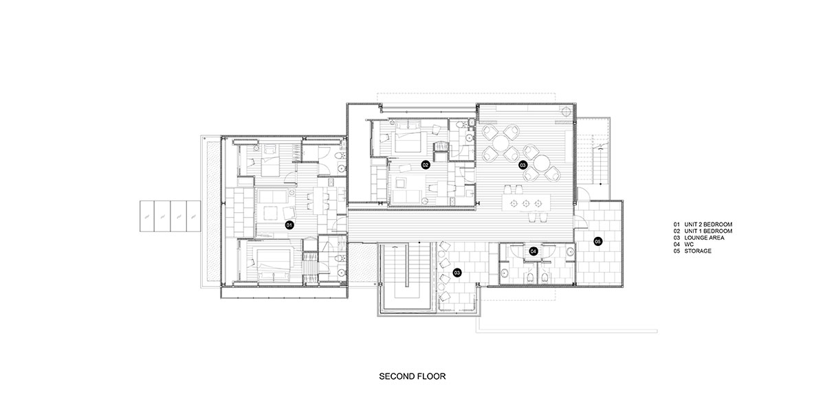
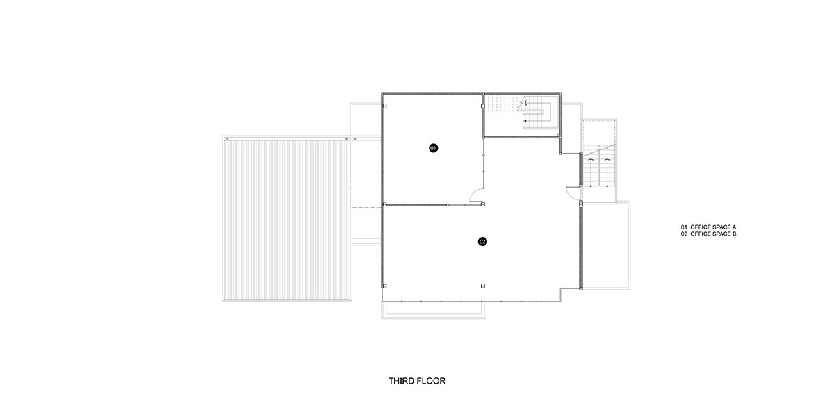
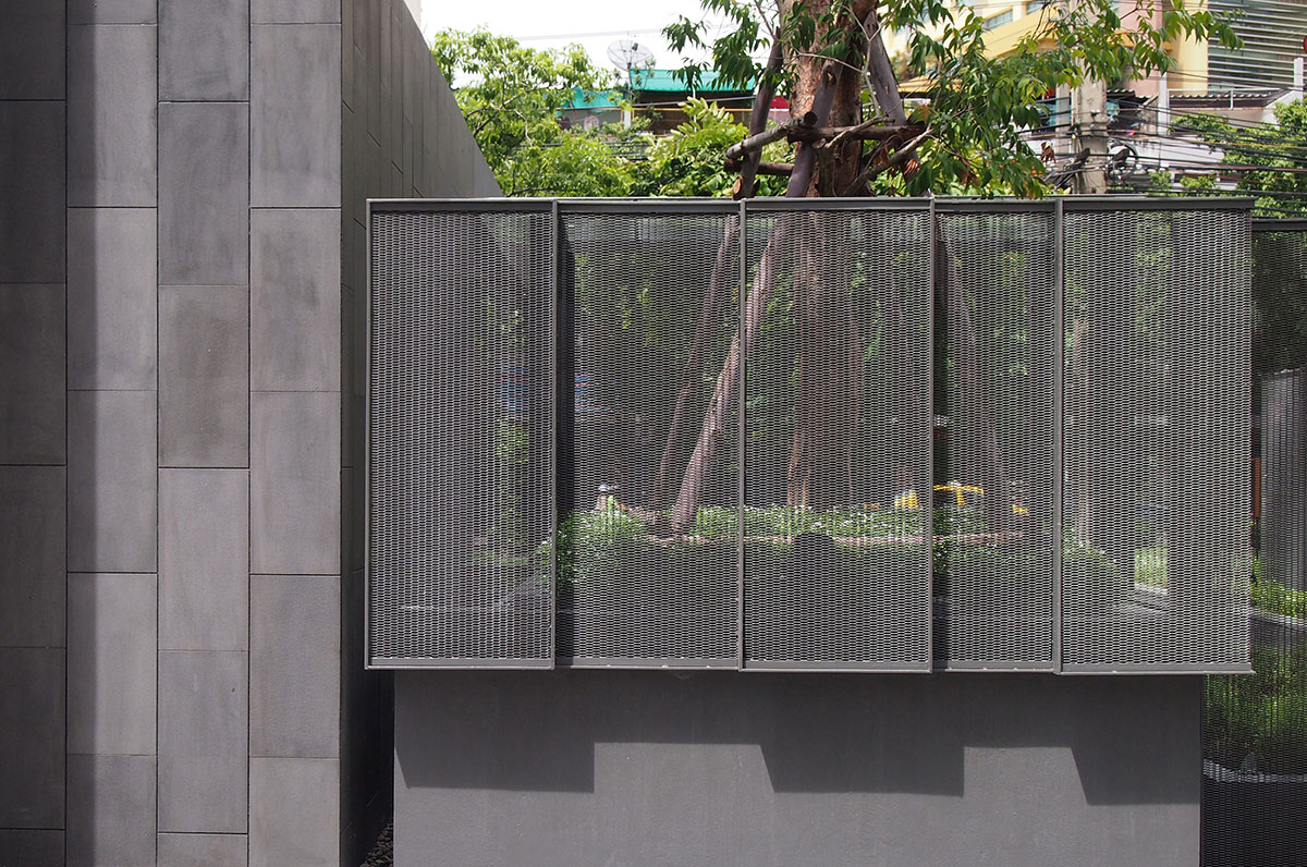
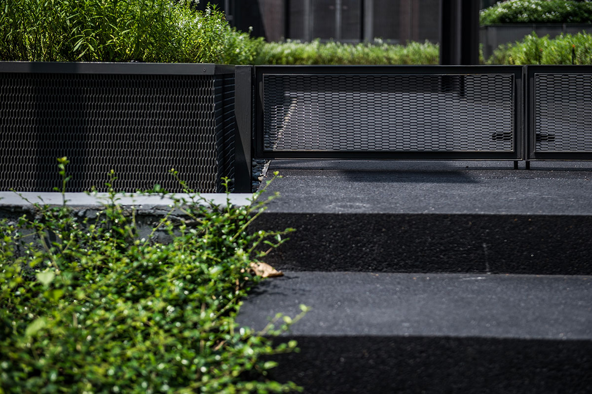
Later on, as the owner came up with the new idea of building the high-rise condominium on the adjacent land, the purpose of this showroom building had been revised to succeed as of a sales gallery called ‘The Portrait.’ Here is the chance that the real steel becomes the real deal. The quality of cut-and-paste structure allowed the architects to alter the building to meet the new condition. Some parts of the building were removed due to the set-back regulation, meanwhile, the new part was added to accordant the purpose of condominium sales gallery; having prototype room for clients. Nevertheless, all the new structure was still setting on the same column spans. Additionally, the sheets of expanded metal were brought to use with the landscape area. Due to its vagueness quality, expanded metal helped covering the unwanted of an unrelated building at the back, at the same time, letting the space and perception to pass through. In four months of time, the Portrait, the new master piece for Stu/D/O will rise and shine on Rama IV, one of the busiest district of Bangkok.
Stu/D/O Team:
Apichart Srirojanapinyo
Chanasit Cholasuek
Landscape Architect: Field Landscape Studio
Interior Architect: Hypothesis 30
Graphic Designer Ravi Itiravivong
Structural Engineer: WOR Consultants
Mechanical Engineer: MEE Consultants
Consultants: PACNS
Visualizer: Stu/D/O
Photography: Stu/D/O, Krisada Boonchaleow
